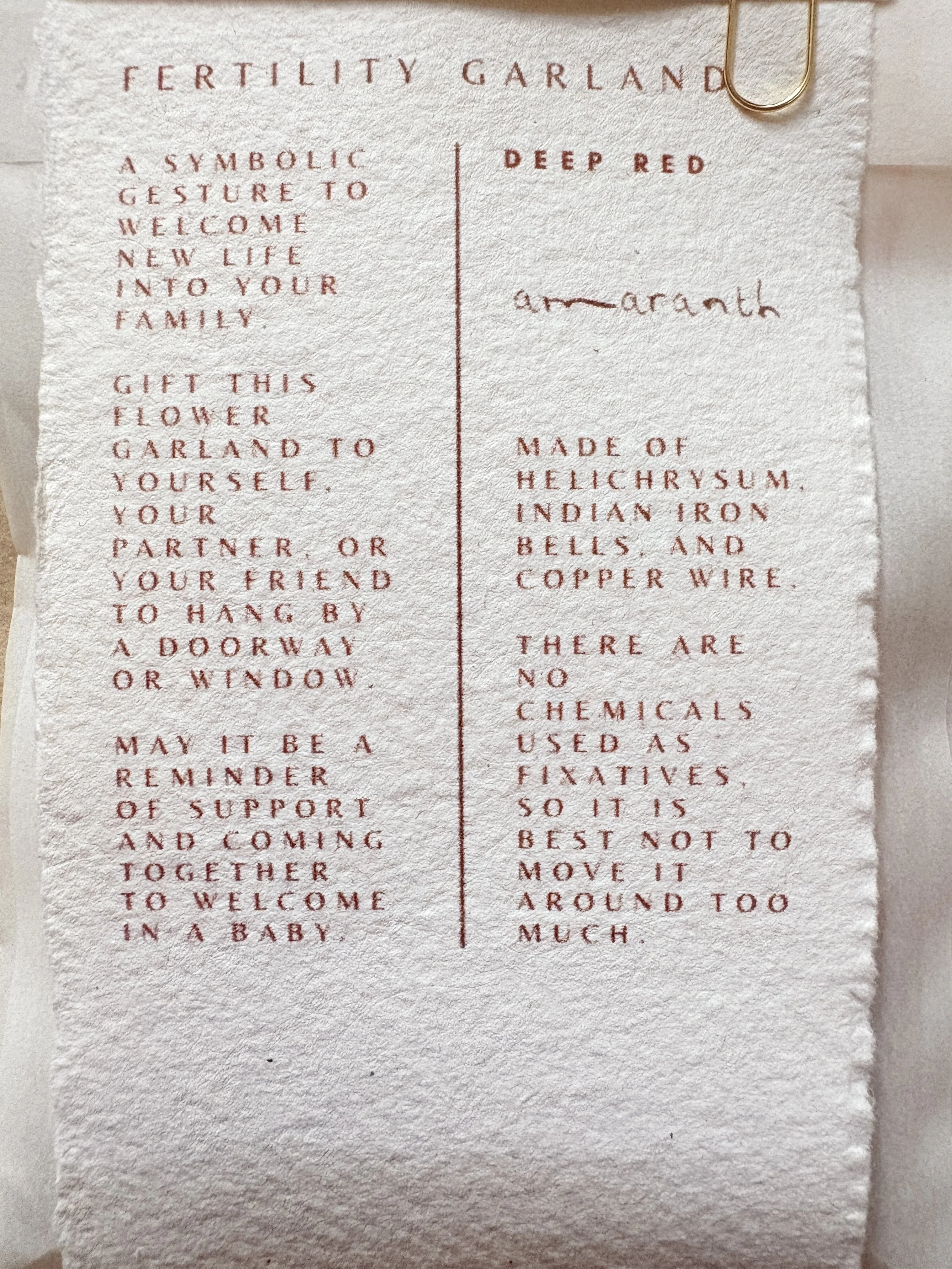
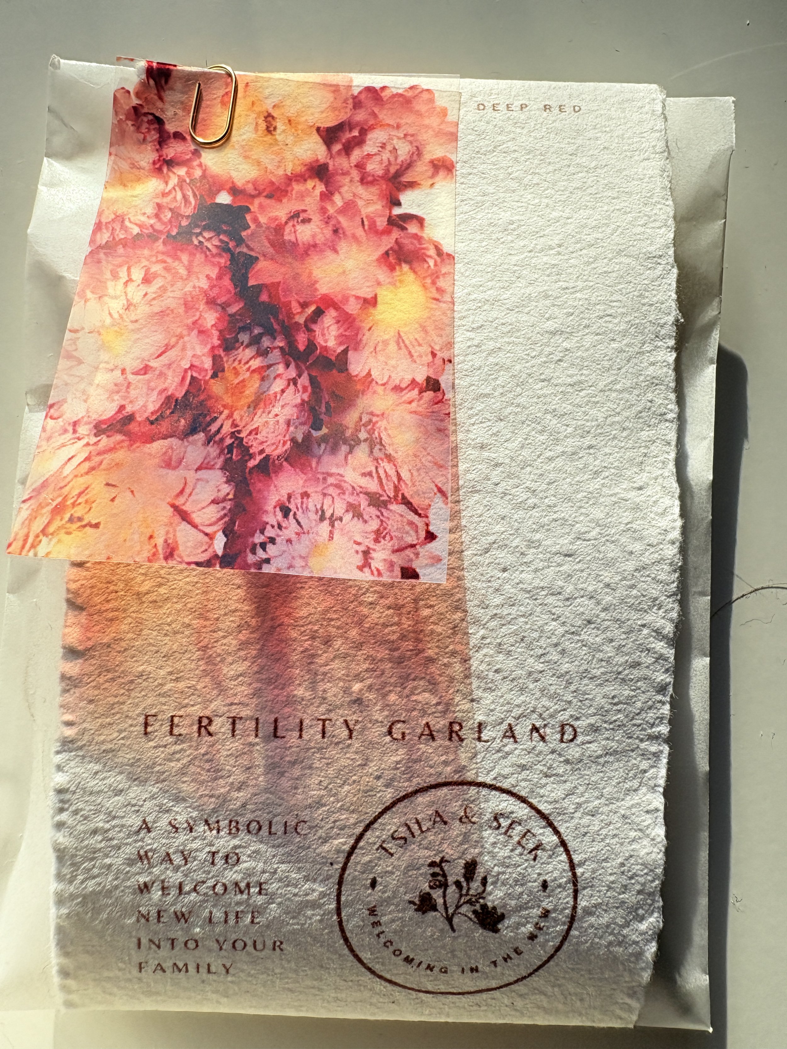
When I was at fine art school, I wanted so badly for there to be a module on paper, understanding different materials, weights, and processes of making paper. There were the basics of course, but I wanted to have an excuse to put mounds of paper in front of me and rub each of them between my fingers, examine their absorbency, their smell, and the way the sun bleached them.
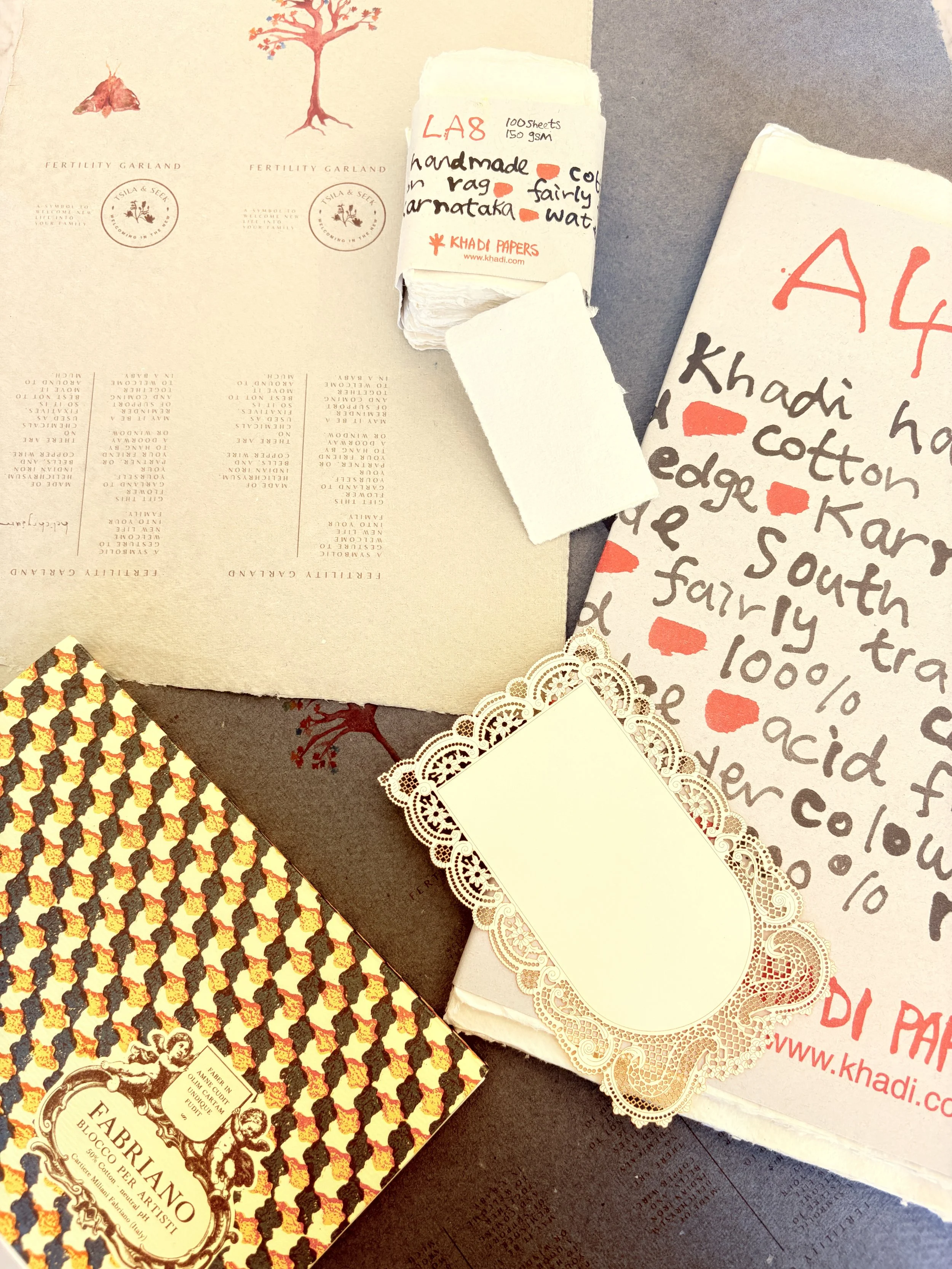

Part of being an maker means having to accept the economics of packaging. Paying for professional designers and printing on paper that was anything near my idea of what would fit for the garlands was way beyond my budget. So I spent months testing different packaging options. For the most part I am form over function, but when you are trying to keep the structure of delicate dried flowers, function definitely demands priority and for the ease of this sentence I’ll include economics under function.
The artwork for my packaging features a watercolour of the flower inside. As a watercolourist, I lean towards a playful childlike aesthetic. I love the softness of watercolour and feel cosy and safe inside a colourful artwork because it feels unaffected by itself.
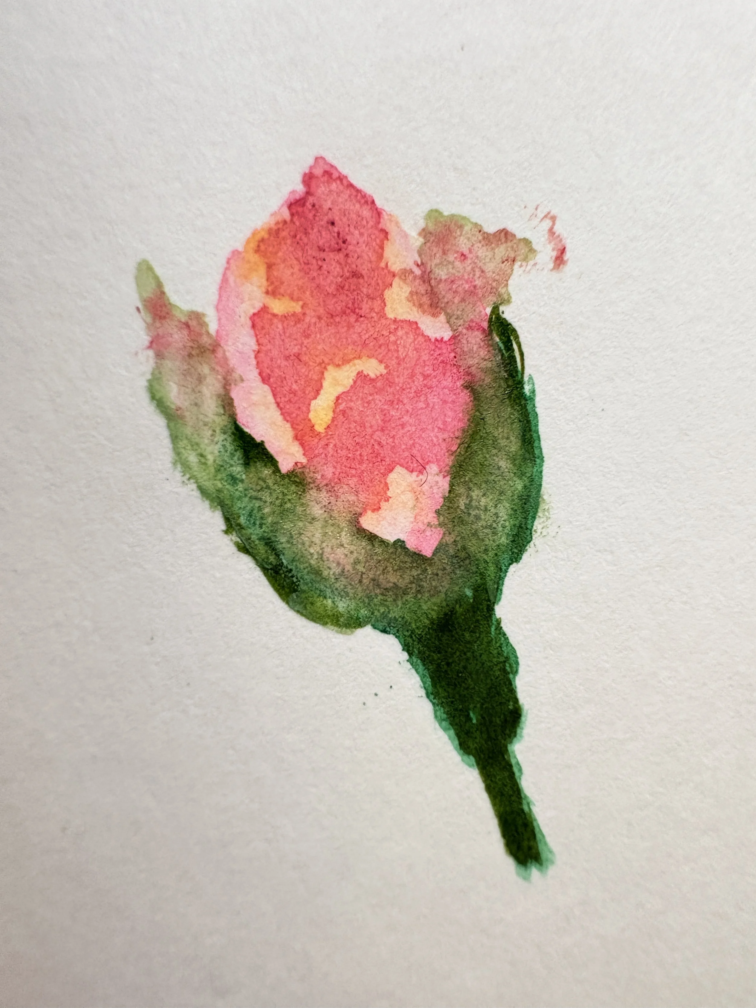
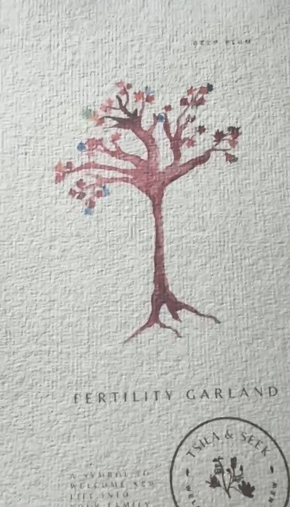
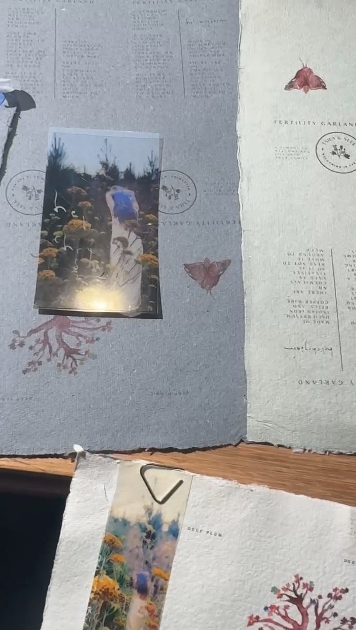
After painting the artworks, I tested printing them on several different types and weights of paper and felt that the colour always felt flat and the artwork seemed unappealing. Thankfully, I already had the perfect paper under my nose. Paper that when printing a digital image of a photograph of a watercolour manages to maintain the energy and whimsy of the original artwork.
For years, my favourite paper to paint on has been the cotton paper from Khadi. Khadi crafts cotton rag paper in India and it has the best texture of any paper I have worked with. For working with watercolour on paper it requires a higher GSM of 320. But for the packaging of the garlands 320 is way too thick and feels clunky, in addition, it is harder to print on. So for the packaging a simple 120 GSM is perfect.